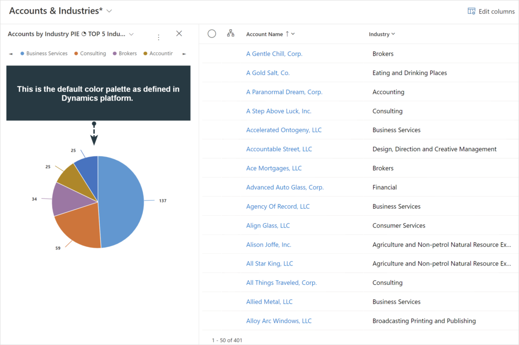
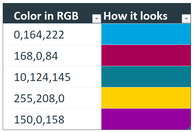
Those who have used Dynamics 365 Sales for a while will have noticed that there are a few colors dominating in Charts . Below are some first few colors from the default palette as defined by Microsoft and I have a feeling many Dynamics 365 Users will be like “Yeah I’ve seen these…” also, “… how do I change the colors?”
Next image is how it looks in an actual Chart in CRM environment.
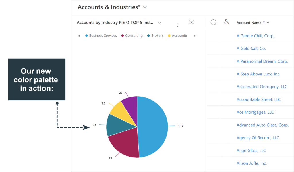
So we figure we don’t like those colors and want to change to something like this:
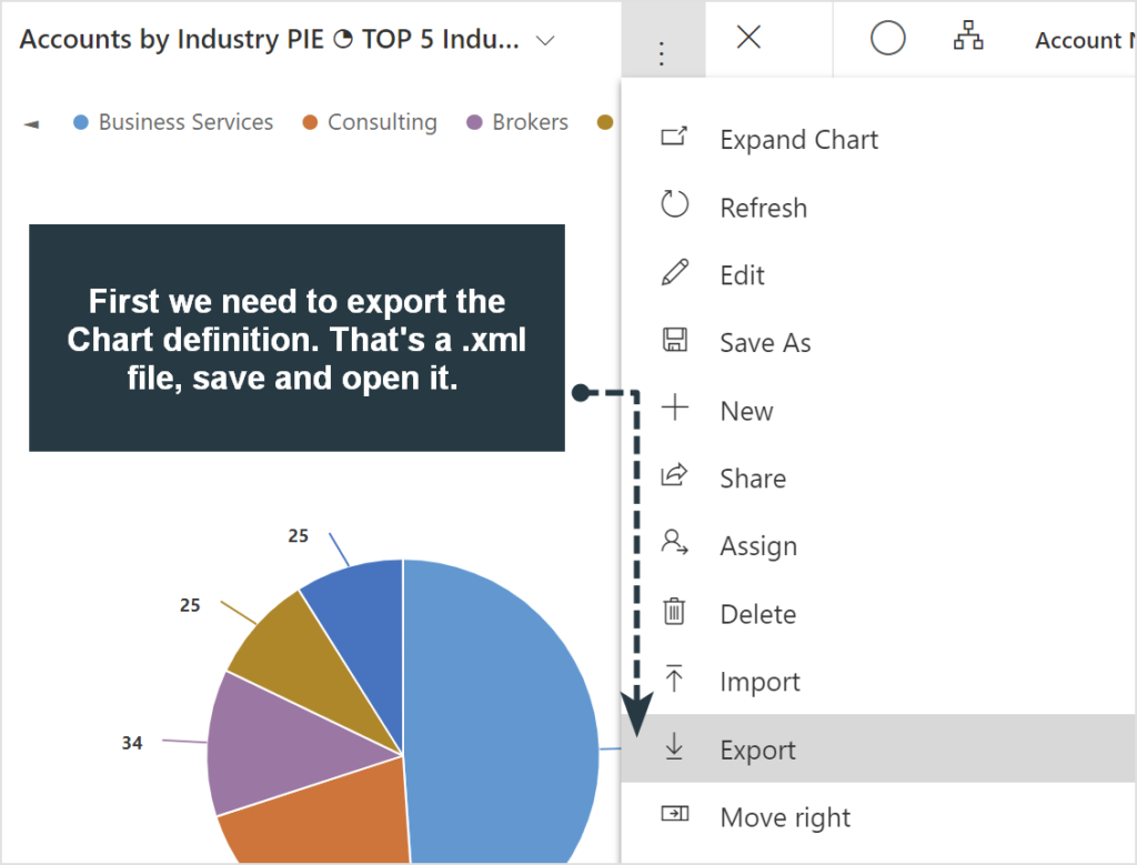
So here’s how to do that. First, click on Export Chart (you can pick any Chart, concept is the same):
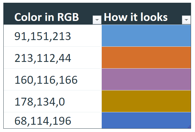
What you will get is an .xml file downloaded to your device. Open it up in any text editor and I’ve highlighted the place where colors are defined, just look for “PaletteCustomColors” and what’s following it. That’s the list of colors in plain text.
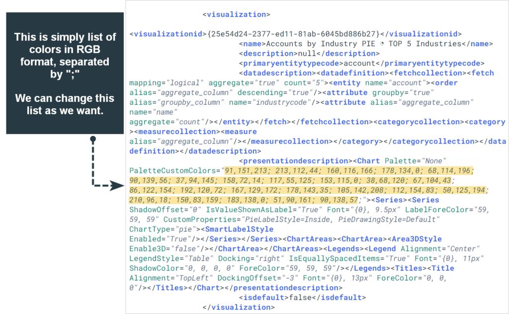
Colors are in RGB (reg, green, blue) format. Use any preferred color picker (can be easily found online) and pick the colors that you want to have in charts. Insert your custom color RGB numbers at the beginning of the color list.
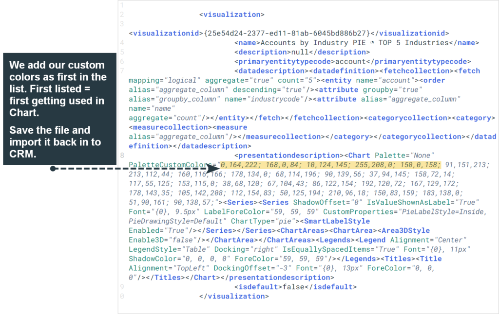
Save the file and upload back to CRM:
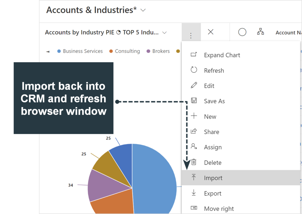
If Chart doesn’t switch to the new color palette at once, do a refresh on the browser window. We can see our new colors in action: